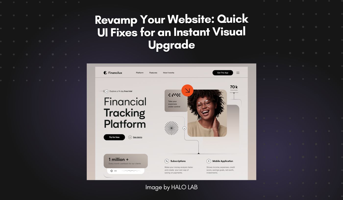
Adding small touches to your website’s user interface (UI) can make a big difference. Whether revamping an existing page or building one from scratch, implementing the right UI elements can drastically improve the user experience.
But what are the best practices to fix the user interface of your website? What are the elements that need to be added or improved? In this article, we will discuss why the visual aspect of your website is important and suggest quick fixes that will make an instant visual upgrade.
Why the Visual Aspect of Your Website Matter?
What’s the first thing that grabs your attention when you visit a website? The answer is simple: the visuals! The appearance of a website is the first impression visitors get. It is the most crucial factor in determining whether people stay and explore what you have to offer or leave immediately.
A visually appealing UI can significantly boost user engagement on your website. A sleek, attractive, and intuitive UI invites visitors to explore, interact with the content, and stay longer on the website. It facilitates seamless navigation, making it easier for users to find what they want.
Besides that, the visually pleasing interface can also help highlight key elements of your site, guiding users effortlessly through different sections and leading them to desired calls to action.
Common UI Mistakes & Quick Fixes for an Instant Visual Upgrade
Even popular websites often need help with UI mistakes that greatly impact visual appeal. Here are some common UI mistakes and quick fixes you should consider to make an instant visual upgrade:
#1. Cluttered Designs & Lack of Whitespace
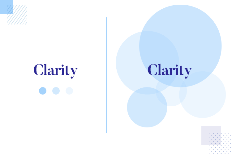
Cluttered design is one of those sneaky issues that creep up on many a website. With each new feature, each new page, and every bit of added content, a website can quickly become a crowded mess. And nothing sends potential customers scurrying faster than a cluttered, confusing site. But here’s the good news: it’s a straightforward fix!
One word: whitespace. Whitespace is the space between different elements on your page, such as text, buttons, or images. It’s well-spent; think of it as your website’s breathing room. Whitespace allows your information to stand out, guides users through your site, and makes your content digestible.
So, to declutter, you first need to simplify. Remove unnecessary elements, reduce the information presented at once, and let your content breathe with ample whitespace. Your users will thank you, and so will your engagement metrics!
#2. Inconsistent Fonts or Color Schemes
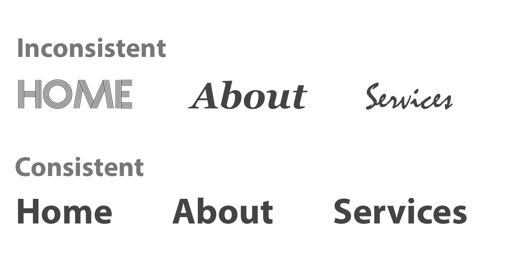
Another common UI issue is the inconsistency of fonts or color schemes. Imagine reading a book where every chapter uses a different font and color – it would be quite disorienting. The same logic applies to your website. Inconsistent fonts and color schemes can leave your visitors feeling lost and disconnected, negatively affecting their overall user experience.
To fix contrast issues, choose a consistent font and color scheme for your website. You can set a style guide with your primary and secondary fonts and color palettes. Your primary font should be clear and readable, while your secondary font can be used for headings and to add interest.
Besides that, your color scheme should reflect your brand and be pleasing to the eye. Stick to these choices consistently across your website, and you’ll create a harmonious user experience that is visually pleasing and cohesive.
#3. Unfriendly Mobile Experience

Nowadays, it is more important than ever to have a mobile-friendly website. With the time people spend on smartphones increasing exponentially, an optimized website for mobile devices has become a must. If your website isn’t friendly for mobile users, they’ll likely leave as soon as they land on it. To make sure that your website is optimized for mobile, you need to:
- Use responsive design: Responsive web design uses a combination of flexible grids and layouts, images, and intelligent use of CSS media queries to ensure your website looks just as good on a smartphone or tablet as on a desktop.
- Prioritize legibility: Make sure the text on every website page is legible. That means using fonts and font sizes that are easy to read, avoiding high contrast between the text color and background color, and ensuring sufficient whitespace.
- Provide intuitive navigation: The last thing you want is for mobile users to get lost in translation when navigating your website. So, enhance your navigation by minimizing the clicks needed to get from one page to another and ensure your menu is easy to read.
Additional Tips for Enhancing Your Website Visuals
In addition to the quick fixes mentioned above, you can enhance your website visuals in several other ways. Here are some additional tips:
- Upload high-quality graphics: High-quality images and graphics can make a difference in your website’s appearance. Choose sharp, crisp visuals that reflect your website’s theme, tone, and message. Images also work great when used to create visual hierarchy, emphasizing important elements and drawing users’ attention where it needs to be drawn.
- Integrate multimedia content for a dynamic experience: Multimedia content, such as videos and animations, can help break the monotony of a website and make for an interesting user experience. Implementing videos on your website or adding interactive elements gives it a boost in terms of aesthetics and usability.
- Use animations and transitions: Animations and transitions are great for making your website look more professional. They can help keep your visitors engaged while providing visual interest and delight. Focus on subtle gestures, hover states, and creative loading animations to give your website an edge.
- A/B test your designs: One of the best ways to optimize your website visuals is to run some tests. A/B testing allows you to compare two-page versions and see which performs better. This feedback can help you identify what works and needs improvement, allowing you to refine your designs continuously.
Ultimately, when revamping your website visuals, the goal is to ensure each element serves a purpose and enhances usability – while making it look great in the process!
Final Words!
Creating a visually appealing website doesn’t have to be complicated. With these quick fixes and design tips, you can easily revamp the visuals of your website, draw in more visitors, and keep them engaged!


