We all know that having an aesthetically pleasing website is important. But what’s even more important is ensuring everyone can access your site, regardless of their visual condition. According to research, 4.5 of the total population have some form of visual impairment, making color-blind accessibility a crucial factor in website development.
In this guide, we’ll look at the various ways you can ensure that your site is accessible to those who are color-blind and how to fix any contrast issues that could be preventing them from using it. So, let’s get started.
Understanding Color Blindness
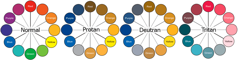
Color blindness, also known as color vision deficiency (CVD), is the inability to perceive color or differences in color. It affects approximately 8% of males and 0.5% of females around the globe, meaning that it’s important for accessibility purposes that your website should be designed with this population in mind.
There are three types of colorblindness:
- Red-green colorblindness affects the ability to distinguish between red and green hues.
- Blue-yellow colorblindness affects the ability to distinguish between blue and yellow hues.
- Total colorblindness, which is very rare and results in the inability to perceive any type of color.
How Color Blindness Affects Web Viewing?
When it comes to web viewing, colorblindness can cause problems when two colors have similar hues or a lack of contrast between different elements on the page. This can make it difficult for people with CVD to differentiate between links, buttons, and other interactive elements on the site. It can also make it difficult to decipher text and images from one another.
For those with red-green color blindness, a site heavily relying on these color cues can be a navigational nightmare. Blue-yellow color blindness brings its own challenges- imagine being unable to distinguish between a sunny yellow ‘Buy Now’ button and the sky-blue background it’s set against!
For that small percentage with total color blindness, it’s like watching an old black-and-white movie, but in a world everyone sees in technicolor.
What Are the Methods to Cater to Color Blindness?
With accessible features, colorblind people can enjoy the same level of access as their peers. Here are some tips you can use to help ensure that your site is accessible for those with CVD:
Deploying Textures and Patterns for Enhanced Contrast
Why not play around with textures when working on elements that need to pop rather than juggling with multiple colors? Think about graphs and charts — they can be a real head-scratcher for our color-blind friends. You can deploy textures and patterns in the background to make them stand out.
For instance, you can combine thin vertical lines with thicker horizontal lines for the bar charts. This will create enough distinction between columns to make them easily readable, even for those with CVDs. Similarly, patterns like dots and grids are a great way to add interest while still maintaining good contrast.
Go For the Basic Color Palettes
When creating a color palette for your site, pick ones that only contain basic colors. This means avoiding colors like pink and purple, which might be difficult for those with color blindness to distinguish from one another.
In addition, choose shades of the same hue for different elements on the page. For instance, if you use blues, ensure they’re all in the same blue family. This will help color-blind users differentiate between them and make it easier for them to navigate your website.
Ignore Non-compatible Color Combinations
Sometimes, certain color combinations just don’t work well for colorblind people. It’s important to be aware of this and avoid using them altogether. Red-green combinations are a good example — if you want to use red, consider adding a highlight or bold font for it to stand out.
Think before you design – don’t let yourself get stuck in a never-ending loop of trial and error. Ignore the combinations like brown and green, blue and green, grey and blue, black and green, blue and purple, and red and green.
Adding Symbols or Icons to Links and Buttons
Another way to ensure your site is color-blind accessible is by adding symbols or icons to the links and buttons. This will make it easier for users with CVDs to differentiate between them.
For instance, if one of your elements on the page is a ‘Download’ button, you can add an arrow icon to it to make it easier for color-blind people to recognize. Similarly, you can add a magnifying glass icon to the search bar on your website to help them find what they’re looking for quickly and easily.
Utilize Tools and Plugins for Color-Blind Accessibility Testing
Testing your website is the surefire way of catching errors that could limit access to those with CVDs. There are plenty of online tools and plugins available that can help you test whether your site is color-blind friendly or not.
For instance, the Color Oracle plugin is a great option that can simulate color blindness and help you understand how your site looks from this perspective. Similarly, ColorSafe is another tool that allows you to create different palettes based on WCAG contrast guidelines to ensure maximum accessibility for all users.
If you need any help with fixing contrast issues on your website, you can contact us today for complete website maintenance service.
Accessible Colors for Individuals with Color Blindness
One of the most important elements regarding color-blind accessibility is choosing the right colors. Here are a few examples of hues that work best for people with CVDs:
White and Black
White and black are the colors that work best for people with CVDs. Not only do they provide good contrast, but they also make it easier to distinguish between text and images.
Blue and Orange
Blue and orange have similar hues but are easily distinguishable from one another. This makes them a great choice for links, buttons, and other interactive elements on the page.
Green and Red
When it comes to red-green color blindness, green and red are the two best options. The difference in hue makes it easier for people with CVDs to distinguish from one another. This can be incredibly helpful when recognizing links or buttons against a background color.
Fixing and Preventing Contrast Issues
While the tips above can help you design a color-blind accessible website, other issues must be addressed. For instance, if your site has low contrast between text and background colors, it will be difficult for those with CVDs to read or navigate the page.
To fix this issue, you can add a layer of transparency to the background color – this will lighten the contrast and make it easier for users with limited vision to read your content. You can also try using high-contrast colors, such as black against white or blue against yellow, to better distinguish between elements on the page.
You should also be mindful when developing new features – test them for color-blind accessibility. This way, you can quickly identify and correct any potential issues before they become a problem.
Final Words!
Creating a website that is accessible to everyone, including those with color vision deficiency, can be a challenge. But by taking the right steps and following the tips mentioned above, you can design an interface that accommodates all users without sacrificing usability or design!
If you need any help with fixing contrast issues on your website, you can contact us today.