Have you ever considered why Facebook is blue or why Google’s logo is a mix of primary and secondary colors? It’s not a random choice. The color palette of a website is much more than an aesthetic matter; it’s a power player in the game of audience engagement.
Colors can evoke emotions, perceptions, and actions, making or breaking a user’s impression of your site. In fact, research suggests that a product’s color can boost the leads/conversion rates by up to 24%. Other studies show that people judge products within 90 seconds, and 62-90% of those decisions are based on color alone.
But where do you start? Before we delve into the importance of colors, let’s step back and understand what a color palette is.
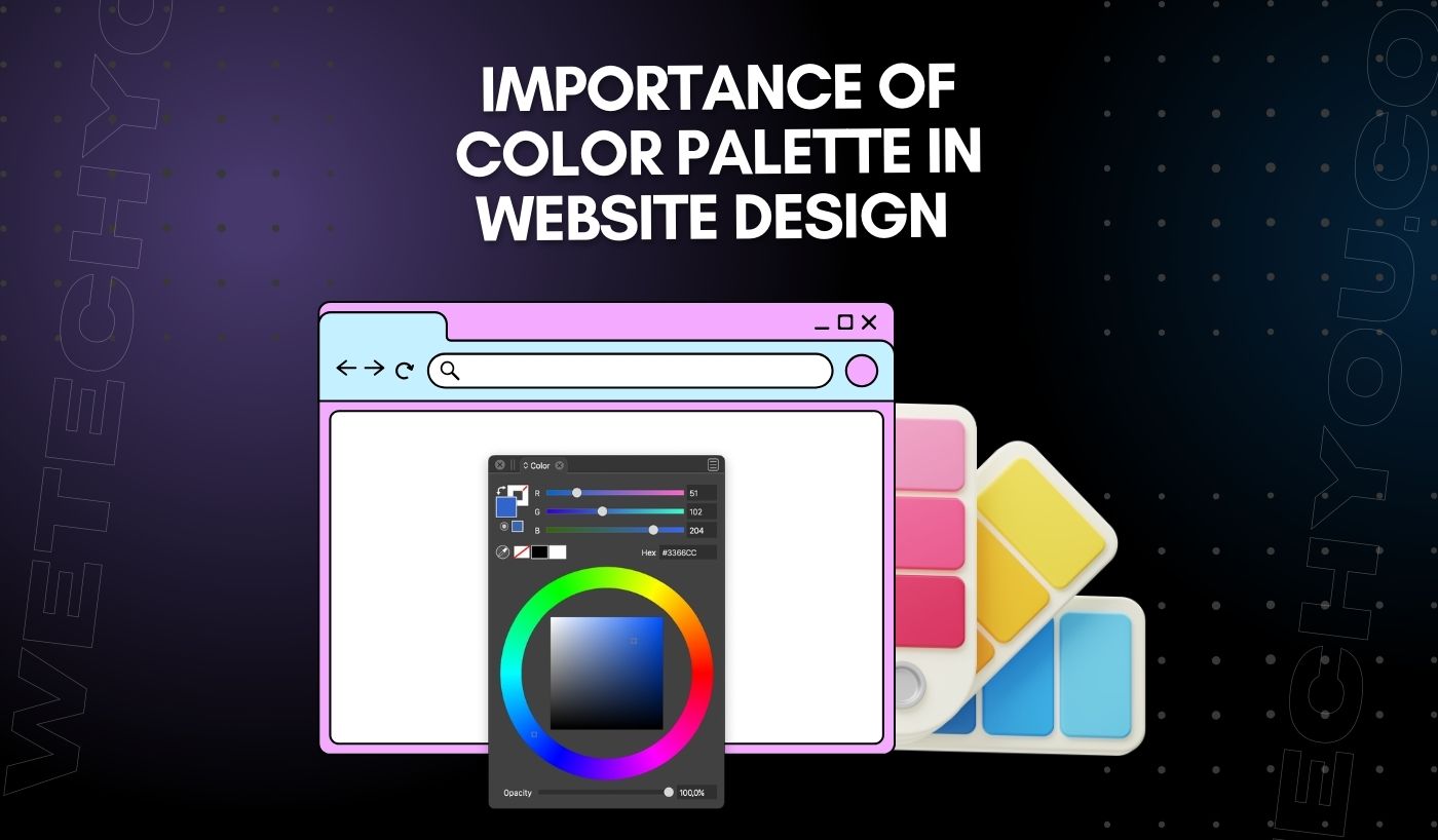
What is Color Palette?
A color palette in web design refers to the selection of colors used throughout a website to maintain consistency, create visual interest, and evoke certain emotions or reactions. This palette often includes primary, secondary, and tertiary colors and associated shades or tints.
For example, consider Google’s minimalist design. The primary color palette comprises blue, red, yellow, and green. These colors are used in the logo, the search buttons, and even the tiny icons on the page. Each color choice in design serves a purpose, contributing to the user’s experience. Blue symbolizes trust and reliability, red evokes urgency and excitement, yellow represents happiness and optimism, and green signifies growth and stability.
When choosing a color palette for a website, UI designers must consider the brand identity, target audience, and the emotions they want to invoke. A well-chosen color palette can significantly enhance the user experience, making the website visually appealing and emotionally engaging.
Types of Color Palettes
You must understand the available palettes when determining the right color palette for your website. Below are the main types of the color palettes:
Analogous
Analogous color palettes are composed of colors that sit next to each other on the color wheel. They often mimic natural colors and are harmonious and pleasing to the eye due to their close relationship. For example, you might see an analogous color palette featuring various shades of blue, from the light blue of a clear sky to the deep blue of the ocean depths.
An analogous color palette can create a rich yet harmonious visual experience in website design. It’s particularly useful when creating a mood or atmosphere on the website, as the closely related shades blend effortlessly.
Monochromatic
A monochromatic color palette is derived from a single base hue, then extended using its shades, tones, and tints — effectively, a single color in different intensities. Due to its minimalistic approach, this color palette exudes a sense of simplicity, balance, and harmony.
A monochromatic color palette in website design can convey a clean, elegant, and cohesive look and feel. It’s an excellent choice for brands that aim for a minimalist, sophisticated, or modern aesthetic. The single color scheme can make the website appear organized, helping users navigate the site effortlessly. However, using a monochromatic palette requires careful planning to avoid monotony and blandness.
Complementary
Complementary color palettes include colors opposite each other on the color wheel. This pair can intensify each other’s brightness when placed side by side, giving the design a dynamic and energetic feel.
A complementary color palette in website design can provide a vibrant and lively aesthetic. This palette can be very effective when you want to draw attention to specific sections or elements on your website, as the contrasting colors naturally draw the eye. However, using complementary colors requires a balance to prevent the design from becoming too overwhelming or straining to the eyes.
Split Complementary
A split complementary color palette is similar to the complementary palette, only with a twist. Instead of two colors opposite each other on the color wheel, this palette includes one base hue and two additional colors adjacent to its complement.
In website design, split complementary palettes create an interesting, balanced look and feel. Combining analogous and complementary colors can create an exciting visual contrast without being too overwhelming. This palette is suitable for sites with a lot of content, as the colors help break up the text and make it easier to read.
Triadic
A triadic color palette consists of three colors evenly spaced around the color wheel, forming a perfect triangle. This scheme offers high contrast while retaining harmony and color richness. Typical triadic palettes include the primary colors (red, blue, and yellow) or secondary colors (orange, purple, and green).
When it comes to website design, using a triadic color palette can give your site a vibrant and lively look without going overboard. The key is to have one dominant color and use the other two as accents. This palette can create stunning, dynamic designs that grab the user’s attention. Just like the complementary palette, you need to strike a balance to avoid a chaotic design.
You may also like this: Quick UI Fixes For An Instant Visual Upgrade
Benefits of Color Palette in Web Design
Enhances Brand Recognition
A consistent color palette helps reinforce brand identity across all mediums. A consumer should be able to associate a certain color or set of colors with your brand instantly. For instance, one immediately thinks of McDonald’s at the sight of red and yellow.
Directs User Attention
Certain colors can draw attention to specific areas of your website. A vibrant ‘Buy Now’ button or a crucial call to action can stand out with the right color choice. For example, green, red, orange, and yellow are best for CTA as they are energetic colors.
Increases User Engagement
The right color palette can have a direct effect on user engagement. Colors can add an emotional aspect to the content, encouraging users to spend more time on the website. For instance, blue is known to be calming and relaxing, while red can increase energy levels.
Improves Readability
Contrasting colors can enhance the readability of the text. A well-thought-out color palette can help make the content more accessible and pleasant to read, leading to higher user engagement.
Sets the Mood of the Website
Colors evoke emotions and set the tone of your website. Depending on your brand message and target audience, your color palette can create a sense of excitement, tranquility, sophistication, or even urgency.
Improves User Experience
A carefully selected color palette helps to create visual harmony, making the navigation through the site more intuitive and enjoyable. This can improve user experience and lead to higher user retention rates.
You may also like this: How to Fix Contrast Issues For A Better User Experience
Supports Website Hierarchy
A color palette can differentiate between elements on the page and create a hierarchy. It’s an effective way to direct users’ attention to specific areas of the website. For example, use brighter colors for important calls-to-action or navigation items and muted tones for less important elements such as footers.
Factors to Consider When Choosing a Color Palette
When selecting a color palette, consider the following factors:
- Brand values and identity.
- Target audience’s taste and preferences.
- Appropriate colors matching with the type of business/industry.
- Emotions you want to evoke in users.
- Creating a visual hierarchy on the page.
- Readability of content.
- Contrasting colors for readability and accessibility.
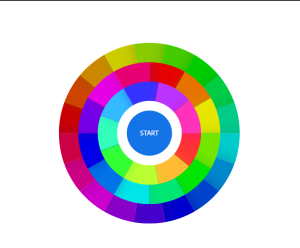
It’s always best to keep your color palette balanced yet flexible enough to accommodate changes as needed. When experimenting with color combinations, UI designers can use various color tools, such as Adobe Color, Coolors, and Paletton.
Conclusion
The color palette you choose for your website will greatly impact the overall design, user experience, and engagement. It’s essential to take the time to select an appropriate color scheme that suits your brand identity and aligns with your target audience. With careful planning, you can create an effective color palette that enhances user engagement and supports website hierarchy.