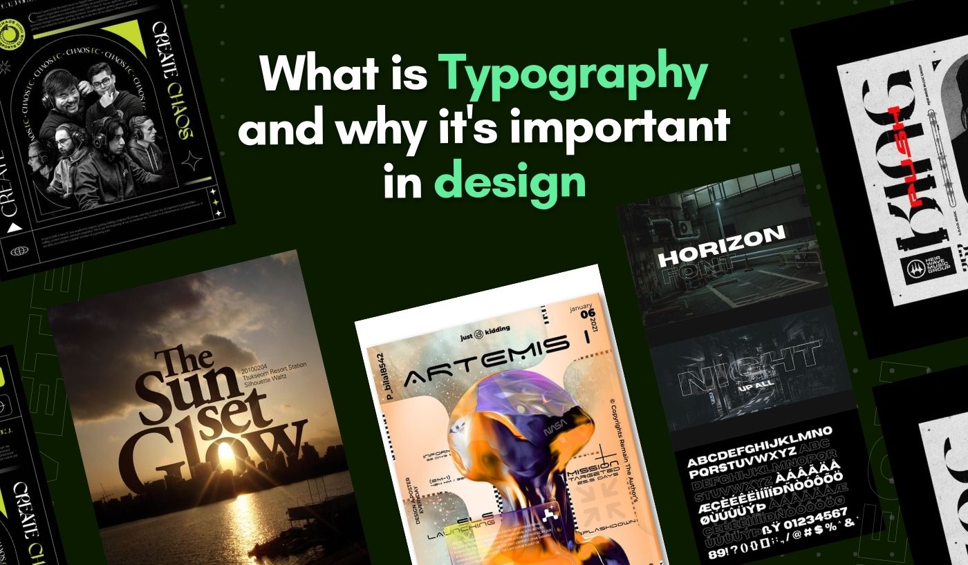
Have you ever looked at a design and thought, “That looks so good!”? Chances are, the designer has effectively used typography to enhance the look of their design. According to research, 95% of web design is typography. Crazy, right?
Now, you must be wondering what typography is? It uses typefaces or font styles to create an aesthetically pleasing design. It’s how these fonts are combined with other design elements to create an overall look and feel for a piece of work.
Typography is important in graphic design because it can help communicate the message or feeling behind a design. It can also create an aesthetic that pleases the eye and draws attention to specific elements. Let’s take a closer look at typography and its importance in design.
What Does Typography Mean?
Typography, in the simplest terms, refers to the art and technique of arranging type to make the written language more appealing to learning and recognition. It involves selecting typefaces, point sizes, line lengths, line-spacing (leading), letter-spacing (tracking), and adjusting the space within letter pairs (kerning).
For example, think about a business card. The person or company’s name might be in bold, large letters, while the contact information could be smaller and less prominent. This is a basic example of typography, where the type size and weight are used to convey importance and hierarchy.
Another example could be a book cover. Notice how the book’s title is usually in a larger, more prominent font, while the author’s name is often in a smaller, less conspicuous one. This typographical decision draws the viewer’s attention to the book’s title, which is generally the main selling point.
Typography plays a crucial role in creating visual identity and hierarchy. Consider a banner on a website. The main heading may be in a large, bold typeface to grab attention, while subheadings and body text are in smaller, lighter fonts. How these different elements are arranged and interact with each other makes the design effective or ineffective.
Good Typography Examples
One great example of typography is the Google logo. The choice of a simple, sans-serif typeface, combined with the playful arrangement and color of the letters, perfectly reflects the company’s mission to make information universally accessible and useful, all while maintaining a sense of fun and approachability.
Another excellent example of effective typography is the ‘The New York Times’ logo. Using a classic serif typeface conveys a sense of authority and tradition, while the subtle but impactful changes made over the years keep the logo contemporary, reflecting the paper’s commitment to delivering accurate and up-to-date news.

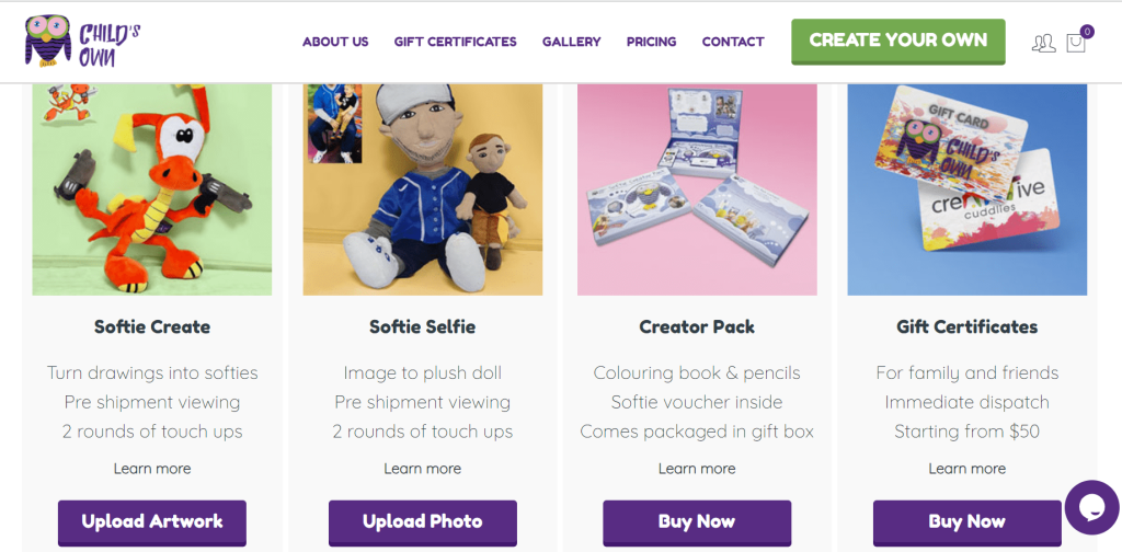
If we talk about typography in web designs, the use of typography can add a unique touch to web design. For example, consider the website Child’s Own, where the two contrasting fonts are used together to create contrast and visual hierarchy while remaining cohesive. The ‘Gloria Hallelujah font is used for headings and the body text, and the ‘Sans-serif’ font creates a playful design that perfectly communicates the company’s vision.
Need designs with perfect Typography for your brand? Have a look at our digital design services and choose the package that suits your business requirements.
Elements of Typography
Typography comprises several elements, such as font style and typeface, size, color, letter spacing (tracking), line spacing (leading), alignment, kerning, hierarchy, and contrast.
- Font Style & Typeface: Font style and typeface refer to the distinct design of a set of characters. For example, Arial and Times New Roman are very different font styles.
- Size: This refers to the size of the characters as expressed in points (pt) or pixels (px).
- Color: Color draws attention to certain elements and sets a tone for your design.
- Letter Spacing (Tracking): Letter spacing can be adjusted to make text more readable. It determines how much space there is between each letter.
- Line Spacing (Leading): Line spacing determines the amount of space between lines of text. It can be adjusted to create more readable text, usually expressed in points or pixels.
- Alignment: Alignment refers to how the characters are arranged relative to one another within a line or paragraph. Common alignment options are left
- Kerning: Kerning adjusts the space between pairs of characters, such as “V” and “A.” By adjusting kerning, designers can create more aesthetically pleasing text.
- Hierarchy: Hierarchy is created using different fonts, sizes, colors, and elements. It helps establish relationships between design elements and clarifies which elements are more important than others.
- Contrast: Contrast is used to create visual interest and draw attention. Using different font styles or sizes, designers can make certain elements stand out more than others.
Typography Rules for Graphic Design
Graphic designers have a lot of responsibility when it comes to typography. They are the ones who decide how typefaces and font styles will be used in design projects. Designers need to have a basic understanding of the rules associated with typography.
Below are a few of the most important rules to keep in mind for graphic designers:
1. Contrast is Key
Contrast, in typography, is a major player in creating an effective design. It’s all about creating a balance that draws the eye and aids in readability. Contrast can be achieved in several ways: size, weight, form, color, and structure.
For instance, pairing a bold, heavy font for the headline with a light, airy font for the body text creates a visually appealing contrast and directs the reader’s attention to the key points. Also, contrasting colors can make certain text elements stand out and guide the audience’s eye through the design.
2. Hierarchy Should Be Clear
Creating a clear hierarchy in your typography is key to guiding your reader through your content. It’s like a map showing viewers where to start and go next. Creating a well-defined typographic hierarchy can drastically enhance the readability and functionality of your design.
For instance, your main heading might be the largest, bold, and at the top, your subheadings could be smaller but still bold, and your body text smaller and lighter. This contrast creates an order of importance, guiding the reader’s eye through the design in a fluid, logical manner.
3. Consistency Matters
Consistency in typography design means maintaining a uniform style throughout your design project. It entails using a consistent font style, size, color, and layout throughout the design. This consistency creates a sense of harmony and cohesiveness that not only aids in legibility but also subtly reinforces your brand identity.
For example, if you’re using a specific typeface for your headings, it’s important to use that same typeface for all your headings. If your body text is a certain size, stick with that size throughout. This avoids confusing your audience and ensures a smooth, uninterrupted reading experience.
4. Mind the Kerning
Kerning is the adjustment of space between characters in a font, aiming to create a visually pleasing effect. It plays a crucial role in typography, enhancing readability and visual appeal. Proper kerning ensures balanced spacing between letters, giving a polished and professional look.
At the same time, poor kerning can lead to awkward gaps and clashes, disrupting the flow of reading and compromising the overall aesthetic. For instance, if the space between ‘A’ and ‘V’ in the word ‘SAVE’ were too wide, it could be misread as ‘S AVE’. On the other hand, if the spacing is too tight, letters may overlap and become illegible.
5. Picking Right Colors
Having the right color palette is essential for creating an effective typographic design. Your chosen colors should be harmonious and tie into your overall brand identity.
Use the same two or three colors throughout your design project to create a cohesive look. Select legible typefaces when set on these colors; avoid light fonts on dark backgrounds or vice versa. Also, be sure to pick easily legible colors and stand out against each other for the best effect.
Final Words
Typography is an important aspect of design. By understanding the basics and rules associated with it, designers are better equipped to create effective visuals that communicate their desired message effectively.
Graphic designers need to be aware of the various elements involved in typography and understand how to use them to their advantage. Anyone can create beautiful and legible typographic designs with a little practice and knowledge!
Need designs with perfect Typography for your brand? Have a look at our digital design services and choose the package that suits your business requirements.